Alright, let’s talk about this “zebra spirit” thing I messed around with today. It started pretty randomly, you know? I was just scrolling through some design blogs, trying to get some inspo for a new project, when I saw this crazy cool zebra print.
And I thought, “Hey, why not try and recreate that digitally?”
So, first things first, I fired up my trusty Photoshop. I figured I’d need a good base color, so I grabbed a neutral gray. Nothing too crazy, just something that would let the black stripes really pop.
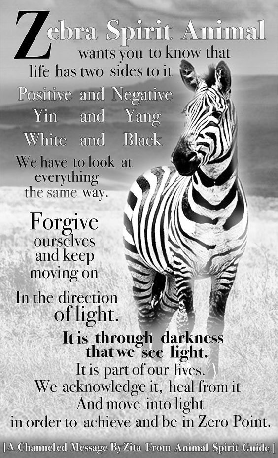
Then came the fun part: the stripes. Now, I didn’t want them to be all perfectly uniform. That’s not how zebras roll, right? So, I used a combination of the lasso tool and the brush tool to create these irregular, kind of jagged stripes. I made some thick, some thin, some long, some short – just trying to keep it random and natural-looking.
I spent a good hour just tweaking those stripes, moving them around, rotating them, making them thicker or thinner. It was kind of a pain, but I wanted to get it just right. I even added a little bit of blur to the edges of the stripes to soften them up a bit.
After I was happy with the basic stripes, I decided to add some texture. I found this cool grunge texture online and overlayed it on top of the zebra pattern. I messed around with the blending modes until I got something I liked – I think I ended up using “Multiply” with the opacity turned way down.
To give it a little more depth, I added a subtle drop shadow to the stripes. Just a tiny bit, so it looked like they were slightly raised off the surface.
Finally, I played around with the colors a bit. I used the color balance tool to add a little bit of warmth to the gray base, and I made the black stripes a little bit darker and richer. I even experimented with adding a subtle gradient to the stripes, but it didn’t really work, so I scrapped that idea.
The result? Not bad, if I do say so myself. It’s not perfect, but it definitely captures the essence of a zebra print. It’s got that wild, untamed feel, but it’s also kind of elegant and sophisticated. I’m thinking I might use it as a background for my next website design, or maybe even print it out and frame it for my office.
- Started with a gray base.
- Created irregular black stripes using lasso and brush tools.
- Added grunge texture overlay.
- Subtle drop shadow for depth.
- Tweaked colors for warmth and richness.
All in all, it was a fun little experiment. It didn’t take too long, and I learned a few new tricks along the way. Plus, now I have a cool zebra print that I can use for whatever I want.

